Almost every complex story can be boiled down to three things: a detail that describes what's happening, one that explains why, and one that predicts what comes next.
Descriptive → Explanatory → Predictive
I learned that framework from Kirk Borne — the astrophysicist and data scientist who, among other things, introduced Donald Rumsfeld to the concept of "unknown unknowns." Borne's approach to making sense of massive, multi-dimensional datasets is simple: ask which details are most descriptive, most explanatory, and most predictive.
It's a question designed for data in fields like astrophysics with hundreds of variables — for example, sky surveys like SDSS catalog objects with 400+ measured attributes. But it works just as well on a development in current events. I used it to understand the U.S. Postal Service's looming budget crisis in about five minutes.
Is it really serious this time?
Today I read Fiona Bork's article on The Hill about the US Postal Service running out of money and clearly, it's complicated. Borrowing caps, pension obligations, regulatory reform, stamp prices, mail volume decline. Congressional politics. A new Postmaster General sounding an alarm after years of controversy around the role.
Is the mail carrier going to stop coming to my house?
I've been hearing about this crisis for years, of course. But when you're reading broadly, it's hard to know what's different this time, what the root cause really is, or what's likely to happen next.
So I used it as a test case for thinking more clearly.
Cutting to the chase
I ran the article through What's Up With That?, the AI reading tool I made to think through complicated articles, reports, and topics. It doesn't just summarize — it contextualizes. In this case it put this story in context of the current state of US federal agencies in general and then separated the signal from noise, identifying what's actually new in this story versus familiar background. Three things jumped out:
1. Postmaster General Steiner framed the revenue collapse as a concrete $86 billion loss, comparing USPS to FedEx and UPS to make a structural problem tangible.
2. He named a specific fix: raise stamps from 78 to 95 cents and change one regulatory body's pricing model. That's it. Most USPS crisis discussions stay at the policy level. Naming a precise price point and a single institutional decision as a complete solution is quite specific.
3. He only discovered the severity of the crisis after taking the job in July 2025 — a signal of governance breakdown, suggesting that even USPS leadership didn't fully grasp the scale of the problem.
Meanwhile, the standard elements — borrowing cap reform, pension restructuring, legislative appeals — were flagged as background. Not new. Not where the story is.
Then I went deeper by letting What's Up With That generate and run a five-step research plan: systems analysis, red-teaming Steiner's framing, historical precedent, power dynamics mapping, and finally, Distill — to capture the key details from both the original story and all the extended automated research.
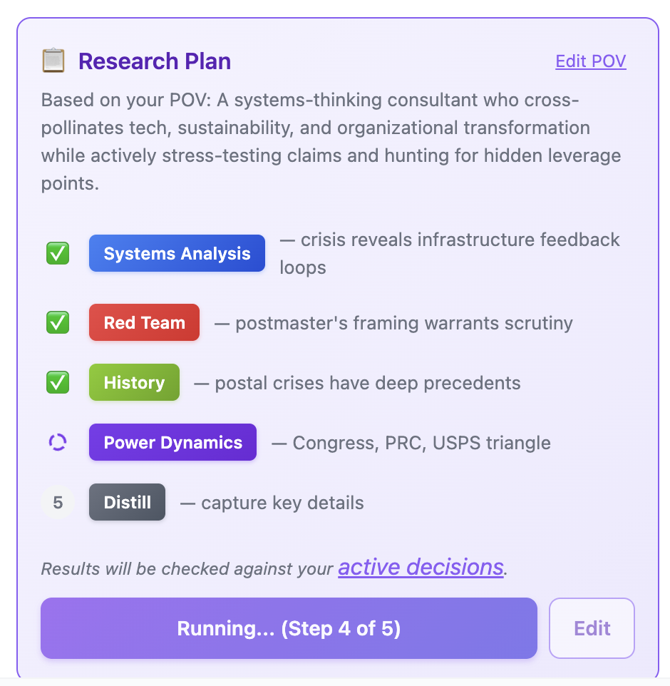
A five-step research plan, tailored to my goals and point of view. The last step is always Distill.
The three key details (in anything)
After analyzing the original article and all that research, Distill applies Borne's framework and selects three details — not from the article alone, but from everything it's now seen:
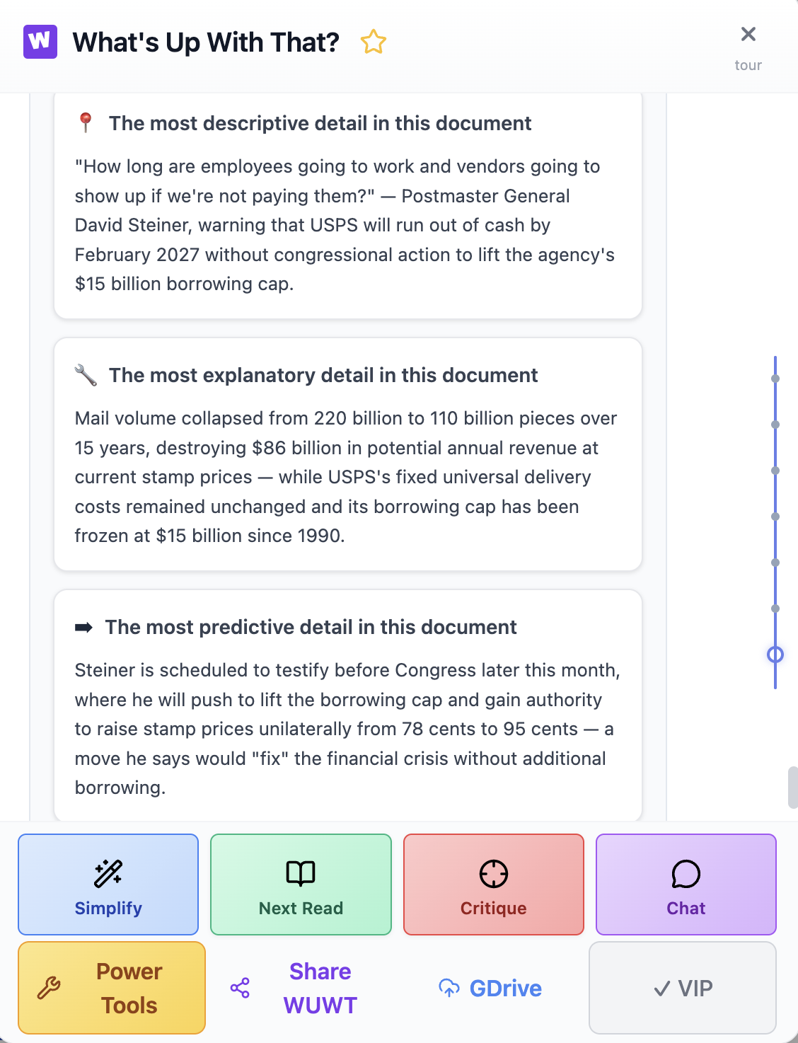
The Distill output: three details selected from the article and all five research steps.
That's it. Three details. I went from foggy to sharp on an issue I've been hearing about for years. Not because I read less, but because I found the right frame and shined a light on the most important details.
Seeing it as a system
Once you have those three details, you can see how they connect. A systems analysis step in the research produced a causal loop diagram that makes the structural trap visible:
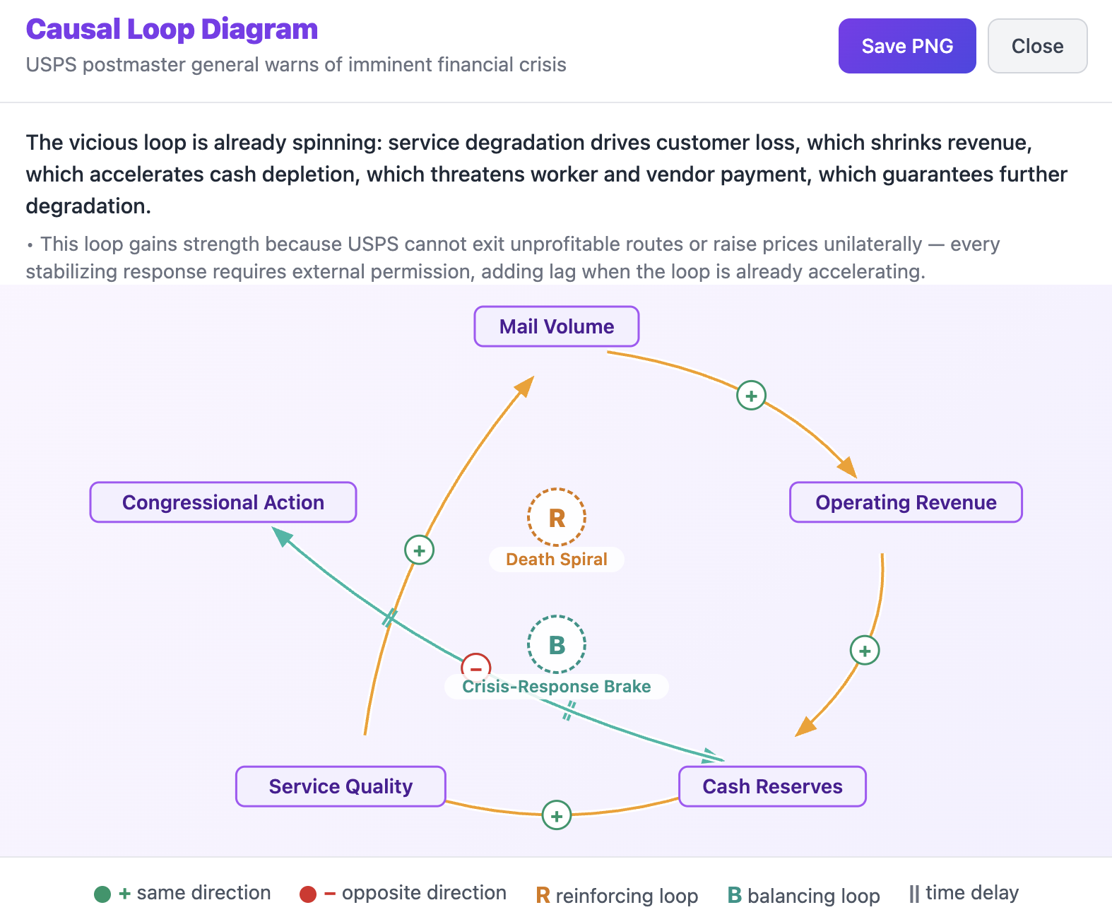
The reinforcing loop driving the USPS crisis. Service degrades, customers leave, revenue drops, cash depletes, and the cycle accelerates.
It might feel counterintuitive to see those plus signs, but they don't just mean "this adds to that" — they mean "this moves in the same direction, good or bad, as that."
Service degradation drives customer loss, which shrinks revenue, which depletes cash, which threatens worker and vendor payment, which guarantees further degradation.
The only brake is congressional action — and it only kicks in when things get bad enough to force political will. That's why Steiner's push for unilateral pricing authority isn't just about stamp prices. It's about breaking the loop without waiting for a system that only reacts to crisis.
A mental model as leverage
The most common response to complexity is either to read more — or throw up your hands and not even try to understand it. Neither of those really help.
Strategic readers do the opposite. They find the right frame. Kirk Borne's question — which details are most descriptive, explanatory, and predictive? — works whether you're analyzing astrophysics data or a news article about the Post Office. The tool I built, What's Up With That?, helps me practice it every day. But the framework works with a notebook too.
One article. Five minutes. Three details and one system diagram. Not a summary — a framework for thinking clearly about a complex situation.
 Chrome
 Firefox